
You’re staring at a spreadsheet containing weeks of research data, knowing you need to transform these numbers into something meaningful for your assignment. The deadline’s approaching, and whilst you understand your findings, you’re wondering how to present them in a way that actually makes sense to your marker. We’ve all been there – brilliant research undermined by lacklustre presentation.
Here’s something that might surprise you: students retain 65% of visual information compared with just 10-20% of written content when tested three days later. Even more compelling, your brain processes visual information a staggering 60,000 times faster than text. That scatter plot or bar chart you’re contemplating isn’t just decoration – it’s the difference between your marker truly grasping your analysis and skimming past it.
The good news? You don’t need expensive software or graphic design skills to create professional data visualisations. Free templates and tools exist specifically for students tackling assignments, dissertations, and research projects. Let’s explore exactly where to find them and how to use them effectively.
What Types of Data Visualisation Templates Work Best for University Assignments?
Understanding which visualisation suits your data is half the battle. Choose the wrong chart type, and you’ll confuse your reader rather than enlighten them.
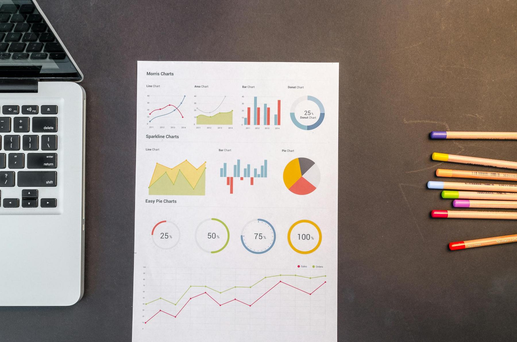
Bar charts remain the workhorse of academic assignments for good reason – they’re universally recognised and excellent for comparing values across categories. Use them when you’re ranking items, showing frequency distributions, or comparing groups. They’re particularly effective in social sciences, business, and education research.
Line graphs excel at demonstrating trends over time. If your assignment involves tracking changes – whether that’s population growth, market trends, or experimental results – line graphs communicate progression clearly. They’re essential for time-series data in economics, environmental studies, and psychology.
Scatter plots reveal relationships and correlations between variables that might otherwise remain hidden in tables. They’re brilliant for identifying outliers and clusters in your data, making them invaluable for statistical analysis assignments and research projects exploring variable relationships.
For more complex data, heatmaps use colour intensity to represent values, allowing you to spot patterns and correlations quickly. They’re particularly useful in biological sciences, data analytics, and any field requiring matrix visualisation. Meanwhile, box plots display distribution, median, quartiles, and outliers simultaneously – essential for comparing multiple groups in statistical assignments.
Pie charts deserve a special mention with a caveat: they’re effective for part-to-whole relationships, but only with 2-7 categories maximum. Beyond that, they become cluttered and difficult to interpret. Many experienced researchers avoid them entirely, preferring stacked bar charts for compositional data.
The research backs up the power of choosing correctly: presentations using visual aids see a 43% increase in effectiveness when persuading audiences, whilst scientific facts presented with graphs achieve a 29% increase in believability compared with numbers alone.
Where Can You Access Free Data Visualisation Templates Without Breaking Your Budget?
You don’t need to invest in expensive software subscriptions. Numerous platforms offer professional-quality templates specifically designed for academic use.
Canva (canva.com) leads the pack with over 1,000 free templates for charts, presentations, and infographics. The drag-and-drop interface means you’ll spend minutes, not hours, creating professional visualisations. Their education-focused templates include pre-formatted sections for research papers and presentations.
Piktochart (piktochart.com) specialises in infographics and data visualisation, offering a free tier with customisable templates and video tutorials. It’s particularly strong for summarising complex research findings into digestible visual formats.
For genuinely sophisticated analysis, Tableau Public (public.tableau.com) provides desktop and web applications for creating interactive visualisations and dashboards. You’ll get 10GB of free hosting and access to a gallery of public visualisations for inspiration. It’s the tool professionals use, and it’s completely free for students.
RAWGraphs (rawgraphs.io) deserves special attention as an open-source visualisation framework built on D3.js. It offers 30 visual models for quantities, hierarchies, and time series, all browser-based with data processed locally – meaning your assignment data stays private and secure.
If you’re working with network data or relationship mapping, Gephi (gephi.org) stands out as the free, open-source platform trusted by over 10,000 peer-reviewed publications. It handles everything from 10 nodes to 10 million, making it suitable for undergraduate essays through to PhD research.
For geographic visualisations, Datawrapper (datawrapper.de) offers simple, browser-based tools for creating interactive charts and maps. Their built-in colourblindness checker ensures your visualisations remain accessible – a consideration that demonstrates academic rigour.
How Do You Choose the Right Template for Your Specific Assignment Requirements?
Matching templates to assignment types isn’t guesswork – it’s strategic thinking about your data and audience.
For essays and research papers, start with Canva’s research paper templates that include built-in visualisation sections, or explore Venngage’s research infographic templates for summarising findings. These integrate seamlessly with academic writing without overwhelming your text.
Data analysis projects demand more sophisticated tools. Tableau Public allows you to create interactive dashboards that let markers explore your data dynamically. RAWGraphs excels at transforming complex datasets into publication-ready visualisations without requiring programming knowledge.
When tackling statistical analysis assignments, LabPlot combines statistical analysis with visualisation capabilities, whilst KNIME helps you build data analysis workflows with professional visualisation outputs. Both are completely free and produce publication-quality results.
For network or relationship analysis – common in sociology, computer science, and biological sciences – Gephi handles social networks and citation networks brilliantly. Cytoscape, originally designed for bioinformatics, now supports any network data through community-developed apps.
Historical or timeline-based projects benefit from Timeline JS for interactive timelines with media support, or Piktochart’s timeline infographic templates. These transform chronological data into engaging visual narratives that markers actually enjoy reviewing.
Here’s a practical comparison of the most versatile free platforms for students:
| Platform | Best For | Learning Curve | Interactive Features | Academic Suitability |
|---|---|---|---|---|
| Canva | General assignments, presentations | Low | Limited | High |
| Tableau Public | Complex data analysis | Medium | Excellent | Very High |
| RAWGraphs | Custom visualisations | Medium | None | High |
| Gephi | Network analysis | High | Excellent | Very High |
| Datawrapper | Charts and maps | Low | Good | High |
| Piktochart | Infographics, summaries | Low | Limited | Medium-High |
What Design Principles Separate Mediocre Visualisations from Exceptional Ones?
Edward Tufte, the pioneer of data visualisation theory, established principles that distinguish professional academic work from amateur attempts. Understanding these transforms your assignments from adequate to outstanding.
Maximise your data-ink ratio: every visual element should represent new information. Those 3D effects and decorative elements you’re tempted to add? They’re “chartjunk” – they distract from your data rather than clarify it. Eliminate unnecessary gridlines, excessive colours, and decorative elements that don’t represent actual information.
Make your visuals self-explanatory: include clear titles, captions, and axis labels with units. Your marker shouldn’t need to cross-reference your text repeatedly to understand your visualisation. Direct labelling – placing labels next to data points rather than requiring legend lookups – improves comprehension dramatically.
Avoid baseline distortion: bar charts must start at zero. Truncating the y-axis might make differences appear more dramatic, but it misrepresents your data and damages your academic credibility. Remember, research shows that illustrated text is 83% more effective than text alone, but only when that illustration represents data honestly.
Consider colour accessibility: approximately 8% of men worldwide experience colour blindness. Using red-green colour schemes excludes a significant portion of your potential audience. Tools like Datawrapper include colourblindness checkers for exactly this reason.
Maintain consistent formatting: uniform fonts, colours, and scales across all visualisations in your document demonstrate attention to detail and academic professionalism. Inconsistency suggests carelessness – exactly what you want to avoid.
The research validates these principles: visual language improves problem-solving by 19% and produces 22% higher results in 13% less time. Groups using visual language reach consensus 21% more often than those without – compelling evidence that good visualisation design matters.
Which Common Mistakes Should You Avoid When Using Free Templates?
Even with excellent templates, certain pitfalls undermine your assignment’s impact. Recognising these saves you from preventable mark deductions.
Choosing inappropriate chart types ranks as the most frequent error. Pie charts with more than seven categories become unreadable. Line graphs for unordered categorical data suggest misunderstanding of basic statistical principles. Scatter plots for time-series data ignore more effective alternatives. Match your chart type to your data structure and research question.
Overcomplicated visualisations with too many data series confuse rather than clarify. If you’re squinting to distinguish between eight different coloured lines on a single graph, break that information into multiple, clear charts. Research demonstrates that visual information improves learning by up to 400%, but only when that information remains comprehensible.
Missing context and attribution represents another critical oversight. Every visualisation needs a title, axis labels with units, legends where appropriate, and source citations for your data. These aren’t decorative – they’re essential scholarly apparatus.
Poor colour choices extend beyond accessibility concerns. Using similar colours for different data categories or randomly assigned colours without meaning wastes cognitive resources. Sequential colour schemes work for ordered data, diverging schemes for data with a meaningful midpoint, and qualitative schemes for categorical data.
Misleading scales damage your academic integrity. Manipulating axis scales to exaggerate differences might seem tempting when results are underwhelming, but markers recognise this immediately. Present your data truthfully – honest visualisation of modest effects demonstrates far more academic maturity than exaggerated claims.
Building Your Data Visualisation Toolkit for Academic Success
Creating effective visualisations isn’t just about passing individual assignments – it’s developing transferable skills valued across every industry and academic discipline. The tools and templates you master during your degree translate directly into professional environments.
Start with browser-based platforms like Canva or Datawrapper for straightforward assignments. As your comfort grows, experiment with Tableau Public for interactive dashboards or RAWGraphs for customised visualisations. If your discipline requires statistical software, invest time learning R with ggplot2 or Python with Matplotlib – these represent industry standards that strengthen your CV whilst improving your assignments.
Remember that 90% of information transmitted by the brain is visual. Your research deserves presentation that matches its quality. Free data visualisation templates provide professional-quality tools without financial barriers. The difference between adequate and exceptional academic work often lies not in the research itself but in how effectively you communicate it.
When you transform raw data into clear, compelling visualisations, you’re not just completing an assignment – you’re demonstrating sophisticated analytical and communication skills that distinguish you from peers. The templates and tools exist. The research validates their effectiveness. Now it’s your turn to implement them strategically in your academic work.
Need help? AcademiQuirk is the #1 academic support service in UK and Australia, contact us today.
Can I use free data visualisation templates for my dissertation or thesis?
Absolutely. Free platforms like Tableau Public, RAWGraphs, and Gephi are trusted by thousands of peer-reviewed publications and PhD researchers globally. The quality of your visualisation depends on your design choices and data integrity, not the cost of your software. Ensure your chosen platform allows high-resolution exports that meet your institution’s submission requirements, and properly cite the visualisation tool in your methodology section.
Which free template platform requires the least technical knowledge for quick assignments?
Canva and Piktochart offer the gentlest learning curves for students without design experience. Both provide drag-and-drop interfaces with pre-formatted templates specifically for academic assignments, allowing you to create professional-quality visualisations within minutes. For data-heavy assignments, Datawrapper balances ease of use with robust analytical capabilities.
Are free data visualisation tools as reliable as paid software like SPSS or Tableau Desktop?
For most undergraduate and postgraduate assignments, free tools provide equivalent or even superior functionality. Tableau Public offers nearly identical features to Tableau Desktop, with the trade-off that visualisations must be publicly published (though they can be removed after submission). RAWGraphs, built on the D3.js library, produces publication-quality visualisations. The distinction lies in advanced enterprise-level features that are rarely necessary for academic assignments.
How do I ensure my visualisations meet academic integrity standards?
Ensure your visualisations adhere to academic integrity by representing your data honestly. Include clear titles, axis labels with units, legends, and source citations. Avoid manipulating scales or using deceptive design elements, and document your visualisation methodology in your assignment to demonstrate transparency.
Should I include interactive or static visualisations in my assignments?
This depends on your submission format and assignment requirements. For printed submissions or PDFs, static visualisations ensure that markers see exactly what you intend. For online submissions or presentations, interactive visualisations can enhance engagement by allowing markers to explore your data dynamically. When in doubt, include high-quality static versions along with optional links to interactive versions.


